Update: Figma enabled publishing of Slides to the Community library, links now point there.
An accessibly editable template for tracking your lean startup experiments, using Figma Slides. Go ahead and check it out, or read on for the story.
Context & challenge
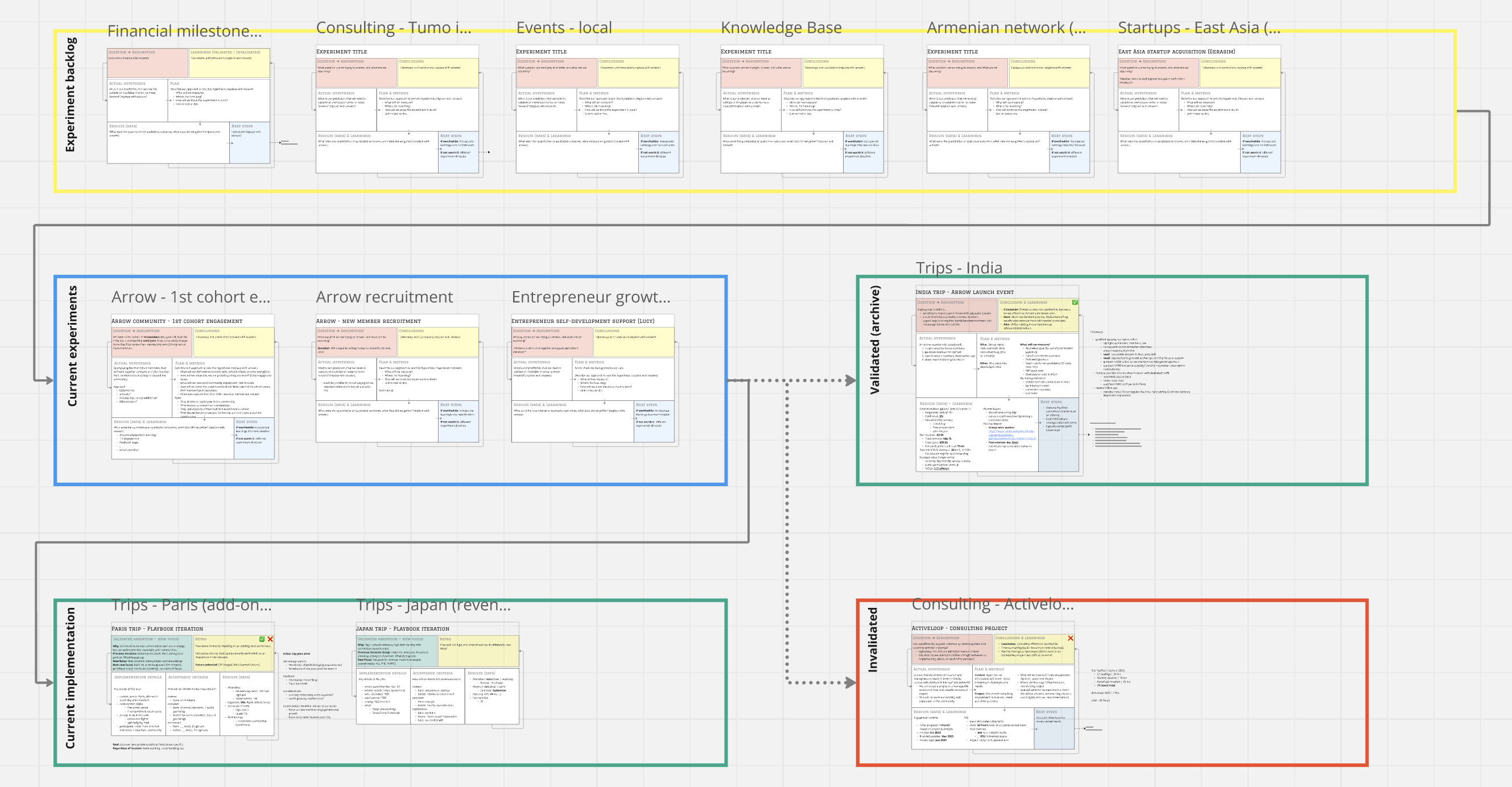
A couple years ago, four of us former coworkers from Vineti embarked on an effort to turn HyeTech, a networking community with ad hoc volunteer events, into a sustainable business. HyeTech’s vision is for the Armenian tech network to become an indispensable global asset that creates positive impact on the world.
During that initial stage, our biggest constraint was our bandwidth. And our biggest risk was trying to do too many things at once, or jumping to start new things before we had generated value from current efforts. At the time, I was also still fully employed at our erstwhile workplace (and later, focusing on my job search), with only a handful of hours a week to devote to any support activities. We had a backlog of granular individual tasks, but no high level view of our work, so it was easy for our attention to become fragmented.
This template was born out of my desire to visualize our high level efforts while encouraging us to more aggressively scope and prioritize our projects.
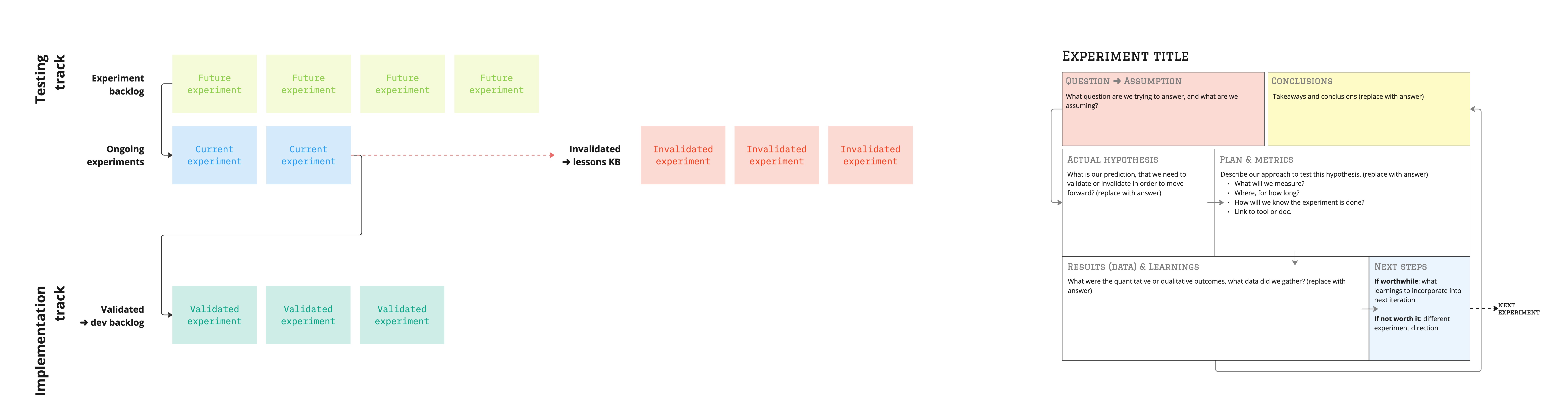
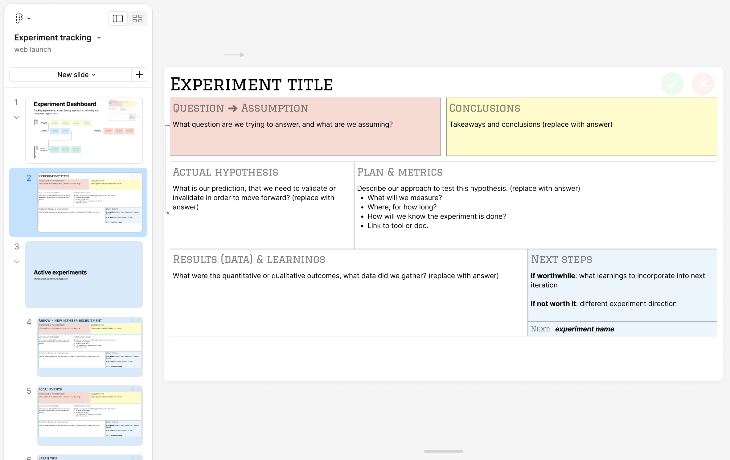
Experiments in a backlog
I wanted to capture a couple concepts in a manageable single-view format: the Lean Startup approach of using experiments to (in)validate your riskiest assumptions, Test your riskiest assumptions and Marty Cagan’s Dual-Track Agile idea of parallel validation and implementation backlogs. Alternately referred to as continuous discoveryand delivery.
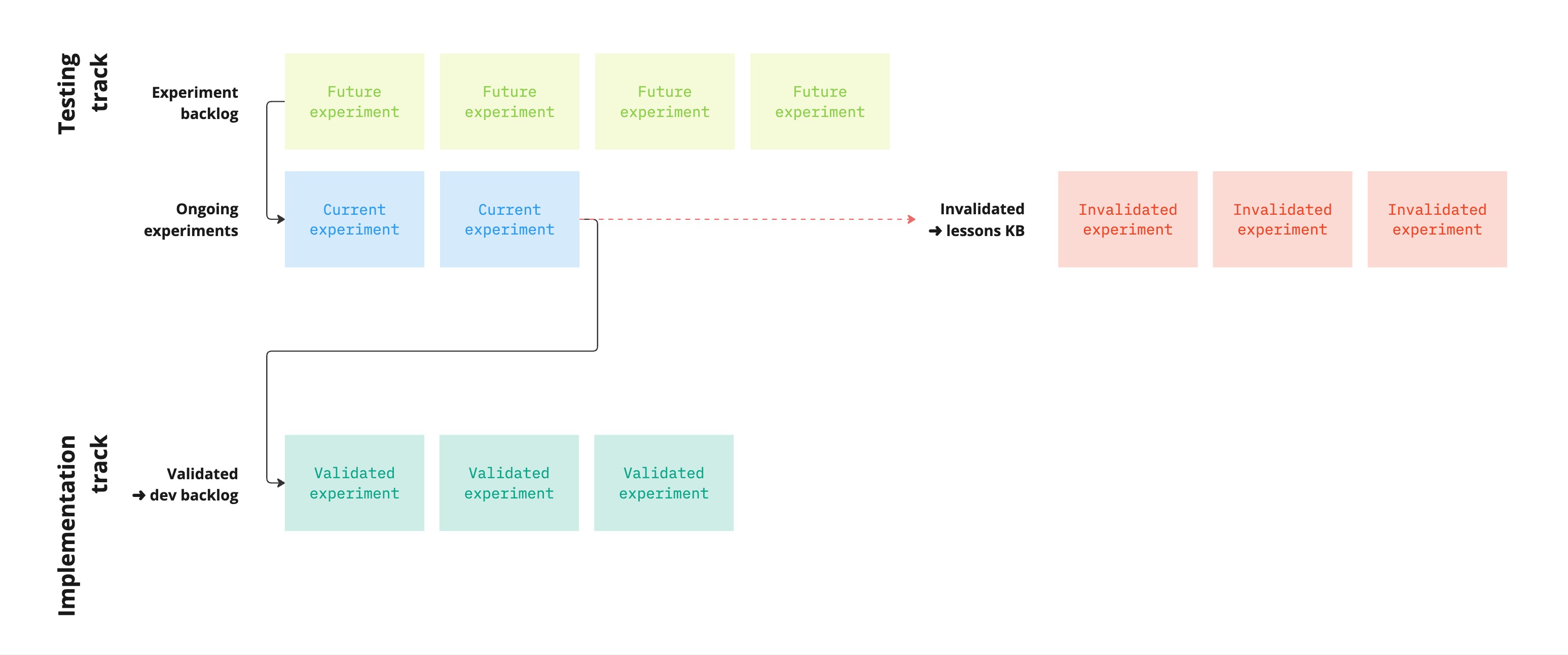
I drew on a few references for the experiment layout, Ash Maurya’s Experiment Canvas and Tristan Kromer’s version were particularly useful, check them out in case they’re more relevant to your needs. as well as comments I remembered Javid Jamae making about maintaining a slide deck of current and planned experiments. Fun memories with from Lean Startup Circle’s monthly unconference in San Francisco back in the day.
First iteration & learnings
My first iteration was a Miro board that captured a general template for an experiment card, along with a path for experiments to move from a prioritized backlog into an active phase.
Miro was useful for organizing everything in a readable zoomed out view, while flexibly updating individual cards without too much concern for actual slide deck constraints. For a tool to review and update as a team, this format worked great and helped our focus for a year or so.
The downsides of Miro, for our team, were that despite Miro’s general usability, I was still the only person who went in to make updates. It was challenging to foster, in teammates who didn’t otherwise have much of a reason to live in the tool, an asynchronous habit of checking or updating Miro. And while Miro is more accessible than Figma for non-designers, moving around between individual cards and between high level and granular views, and adding content, required relatively manual navigation and object resizing.
Figma remake & tradeoffs
Recently, Figma released a slides tool Figma Slides blends Figma’s design tools with a familiar slide layout. that offers a bridge to users more familiar with presentation apps, for whom the designer’s view of Figma is intimidatingly alien. Similar to how Figma’s recently released Dev Mode caters to the needs and conventions of developers who are implementing designs. The combination of individual slide view with a flexible deck overview looked like it had potential for our needs, so I tried adapting my Miro approach to Figma.
The clear advantage of Figma Slides for our experiment dashboard template is the familiar slide UI, with more accessible editing and navigation. The format lowers the bar for reference and editing by non-designer stakeholders. And because it has many of Figma’s affordances, I could build the slide sections with autolayout and not have to worry about resizing everything around the text.
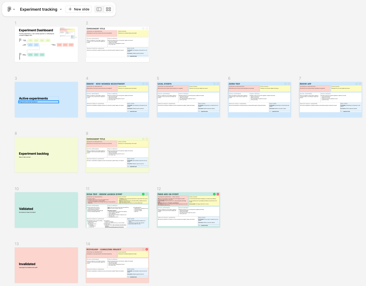
Figma Slides also offers a simple and flexible tile view that’s easy to move around and organize, great for reviewing the big picture.
The primary tradeoff of the slide view is the lack of flexibility in slide dimensions. Despite Figma’s ability to use autolayout to dynamically adjust template content within constraints, they chose to keep a strict fixed dimension for individual slides.
In our case, this means that if we have a particularly large amount of content for a particular experiment (detailed plans, large list of metrics, etc), then we either need to make harder choices about what needs capturing, or we need to split an experiment across a couple slides.
Template notes
Give it a whirl if it looks useful for your own needs. Some notes:
- Figma doesn’t yet support components in Slides, so for now there isn’t a way to edit the template across all slides. That said, besides the two-slide version and the Appendix examples, you should be able to tweak the primary template to your needs without too much hassle.
At the moment it appears only Figma employees and hand-picked designers can publish their contributions to the Figma Community, so this is simply a public link to my template file.Now added to the Community Library!- Feedback welcome as comments directly in the file or on the Community library page. Learning in public, something I am also practicing with this site. You can try messaging me on other platforms, but commenting directly is the most contextually helpful.